15 Stunning Green Backsplash Kitchen Ideas for Modern Homes
- Kitchen Decor Idea
Admin
- 0
- 40 minutes read
Look, I get it. Walking into a kitchen renovation or even a simple weekend refresh is terrifying. You stare at Pinterest boards until your eyes cross, you order fifty samples that all look the same in bad lighting, and eventually, the safety of a plain white subway tile starts calling your name. It’s the vanilla ice cream of design—safe, reliable, hard to mess up, but let’s be honest… a little bit boring.
Why settle for “safe” when you can have spectacular?
I’ve spent years obsessing over kitchen aesthetics—I’m the friend who touches the walls in restaurants to check the tile texture—and if there is one hill I am willing to die on, it’s that green is the new neutral. It’s nature’s favorite color for a reason. Green breathes life into a space. It connects your home to the outdoors, calms the chaos of a Tuesday night dinner rush (trust me, you need that), and adds a layer of sophistication that the endless sea of grey kitchens just can’t achieve.
Whether you want a moody, dark forest vibe that feels like a speakeasy or a light, airy mint situation that wakes you up faster than your espresso, there is a shade of green that will completely transform your cooking space.
So, put down the white sample tile. Seriously, put it down. Step away from the “Greige.” We are going to explore 15 Stunning Green Backsplash Kitchen Ideas for Modern Homes that will make your neighbors jealous and your morning coffee taste better. (Okay, I can’t promise the coffee thing, but the jealousy is almost guaranteed.)
Let’s break down these ideas, chat about the annoying installation quirks nobody tells you about, and figure out exactly how to style them without losing your mind.
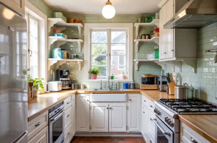
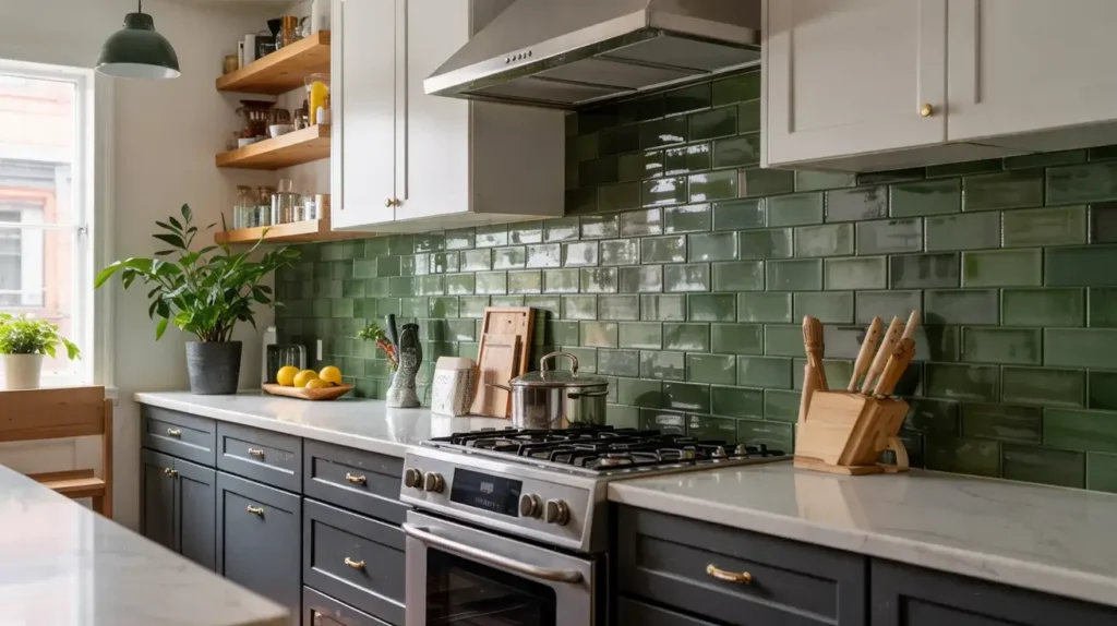
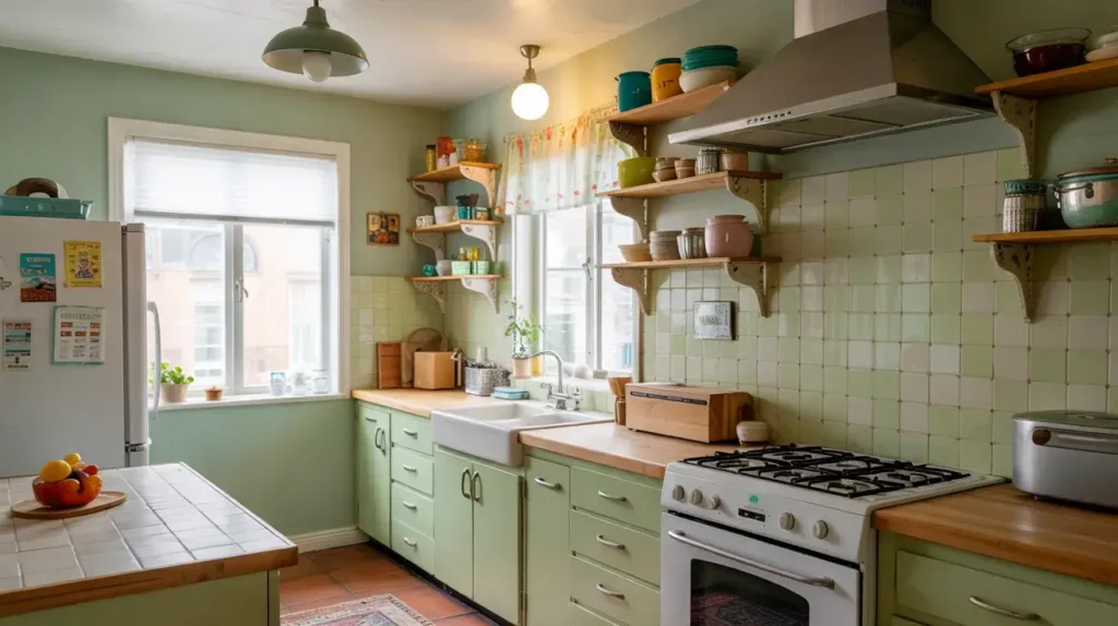
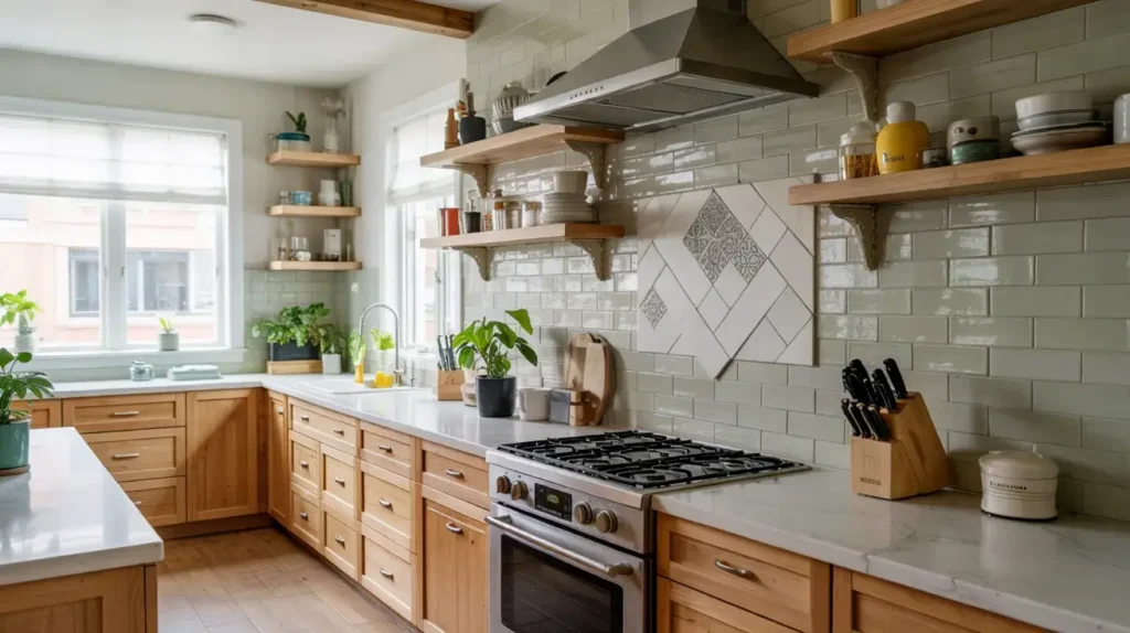
1. Sage Green Subway Tile Backsplash
Let’s start with the gateway drug of green tiles: Sage Green. If you are nervous about committing to color because you’re afraid you’ll hate it in six months, this is your best friend. Sage green subway tiles offer that classic, timeless shape we all know and love, but with a soft, earthy twist that feels incredibly organic. I love this option because it feels historic and modern at the same time—it’s like the cool aunt of kitchen design.
Why It Works So Well
Sage is soothing. It doesn’t scream for attention; it just politely asks you to admire it. When you use a standard subway tile layout (brick pattern), you keep the design grounded in tradition. This prevents the kitchen from looking “trendy” in a bad way. You won’t hate this in five years, which is a massive plus in my book. It bridges the gap between farmhouse comfort and modern minimalism.
Styling Recommendations
You have to pair this right to make it pop, or it can look a little washed out.
- Cabinetry: Cream or off-white cabinets look stunning here. If you want more contrast and a more modern feel, try natural white oak. The wood tones warm up the sage beautifully.
- Hardware: Unlacquered brass is the winner, hands down. The warmth of the gold tones brings out the yellow undertones in the sage. Chrome can make sage look a bit gray and sad.
- Grout: Stick to a creamy white or a very light grey. A distinct dark grout might make it look too busy and take away from the calm vibe.
My Honest Verdict:
- Pros: Timeless appeal, easy to resell (buyers love sage), widely available at big-box stores.
- Cons: Can look a bit generic or “Pinterest Farmhouse” if you aren’t careful with your accessories.
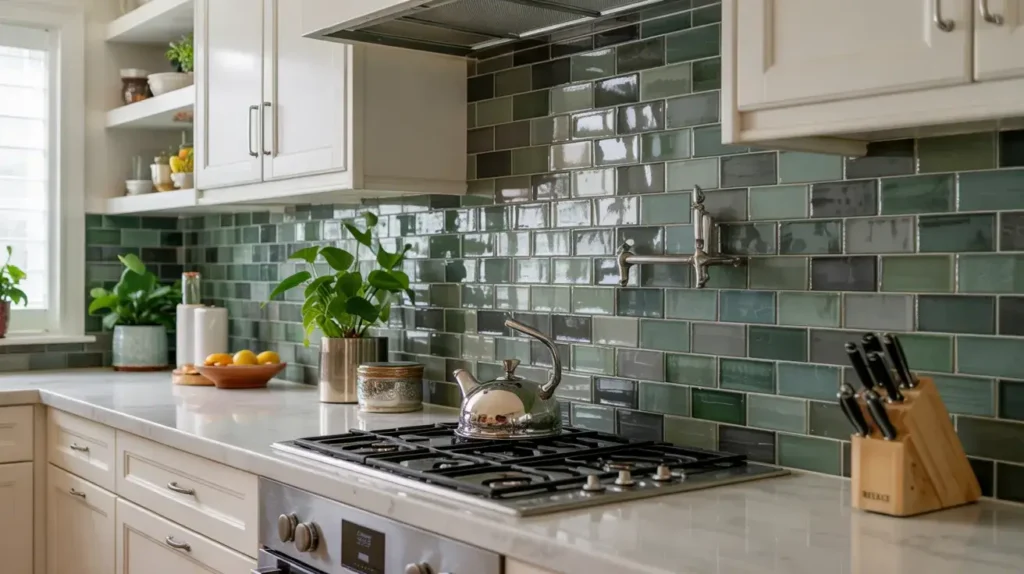
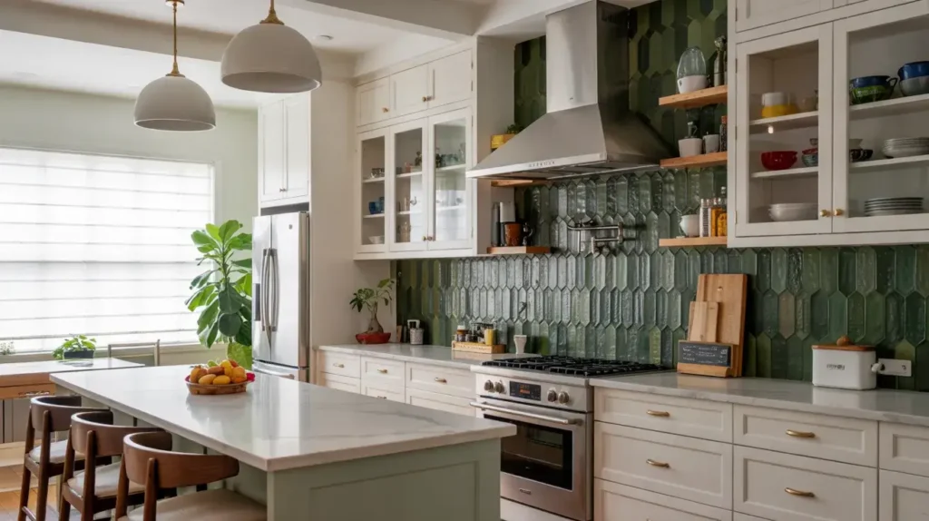
2. Emerald Green Zellige Tile Feature
Now we are turning up the heat. Zellige tiles are handmade clay tiles from Morocco, and they are absolutely imperfect. And by imperfect, I mean they are uneven, chipped, wobble on the wall, and vary wildly in shade. That is exactly why I am obsessed with them. An Emerald Green Zellige backsplash reflects light in a way that flat, machine-made tiles just can’t.
The Texture Factor
Because these tiles have an irregular surface, they shimmer like the surface of a lake. It looks like jewelry for your wall. In a modern home that often features flat cabinets and sleek quartz, this texture prevents the room from looking sterile. It adds soul. However, be prepared for your tile installer to hate you. Installing these requires patience because there are no spacers; you stack them tight and just pray.
What to Watch Out For
- Cleaning: Real talk? The uneven surface captures dust and grease more than a flat tile. You need to wipe these down actively. If you fry a lot of bacon, maybe keep this behind the coffee station instead of the range.
- Cost: These are pricey. Imported Zellige is an investment, but it acts as the main art piece of the room.
Design Insight:
If you go this route, keep your countertops simple. A quiet white quartz allows the Emerald Green to be the star. Don’t let your counter fight with your backsplash for attention—it’s a fight the counter will lose.
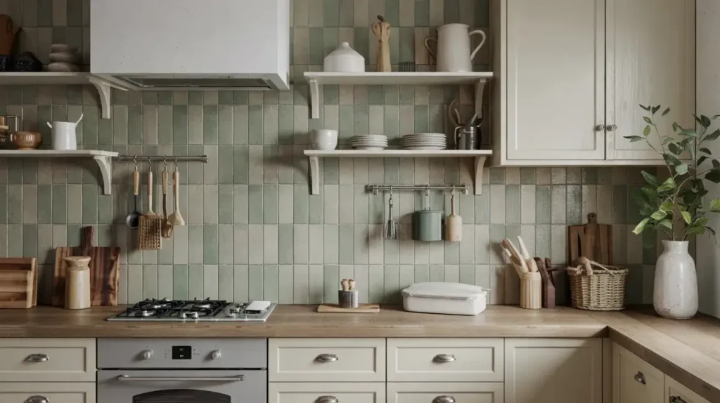
3. Olive Green Matte Ceramic Backsplash
Maybe you hate shine. Maybe you want something that feels like a velvet jacket for your kitchen. Enter the Olive Green Matte tile. Matte finishes absorb light rather than reflecting it, creating a deep, saturated color experience. Olive green specifically feels very “old world” yet fits perfectly in a contemporary setting.
The Sophistication of Matte
I find that matte tiles hide water spots better than glossy ones. If you are a messy cook (no judgment, I am too), a matte olive surface is forgiving. The color suggests nature—think dried leaves, moss, and forest floors. It brings a grounded energy to the room that feels very “adult.”
Styling the Look
- Countertops: Butcher block looks incredible with olive. The wood tones complement the green perfectly, creating a rustic-chic look.
- Lighting: You need good under-cabinet lighting. Since matte tiles don’t bounce light around, your corners can get dark. Ensure your workspace is bright enough so you don’t chop a finger off.
My Take:
This is the choice for the intellectual kitchen. It feels studious and serious. If you want a fun, poppy, energetic kitchen, skip this. If you want a kitchen that looks like it reads leather-bound books and drinks scotch, buy this tile.
4. Forest Green Glossy Tile Accent
If Olive Matte is the studious librarian, Forest Green Glossy is the dramatic theater kid. This look is all about mood. Deep, dark forest green creates a sense of depth that actually makes small kitchens feel bigger because the walls seem to recede into the shadows.
Creating Drama
I love using a high-gloss finish here because it creates a mirror-like effect. Even though the color is dark, the reflection bounces light around the room, making it feel glamorous rather than gloomy. It feels luxurious, like a high-end cocktail bar in London.
Design Pairings
- Cabinets: Go bold or go home. Charcoal grey or black cabinets paired with forest green tiles create a moody, monochromatic masterpiece. It’s a bold move, but it pays off.
- Metals: Polished nickel or chrome cuts through the darkness and adds sparkle. Brass works too, but silver tones make it feel more modern and sharp.
Pro Tip:
Use a dark grey grout. White grout creates a high-contrast grid pattern that can look harsh and busy against dark green. Dark grout makes the wall look like one seamless sheet of color. IMO, seamless is always better for dark colors.
5. Mint Green Glass Tile Backsplash
Okay, let’s lighten things up. Mint green glass tiles are for the people who want their kitchen to feel like a breath of fresh air. Glass tiles have a translucency that ceramic doesn’t; they have depth behind the glass surface, giving them a watery, luminous quality.
The Retro-Modern Vibe
Mint naturally leans a little retro (think 1950s appliances and diners), but the glass material brings it firmly into the 21st century. It feels clean, hygienic, and bright. This is fantastic for kitchens that lack natural light because the glass amplifies whatever light you do have.
Where to Use It
I recommend this for beach houses, cottages, or small apartments that need energy.
- Avoid: Don’t pair this with yellow-toned wood cabinets (like honey oak). It can look a bit sickly and dated.
- Do: Pair with crisp bright white cabinetry and stainless steel appliances. It creates a “clean lab” look that is very satisfying.
Honest Opinion:
Glass tiles can look dated if you pick the tiny 1×1 mosaic squares. Please don’t do that. Go for a larger subway size (3×6 or 4×12) to keep it modern. We aren’t trying to recreate a 2004 bathroom here :/
6. Dark Green Herringbone Tile Design
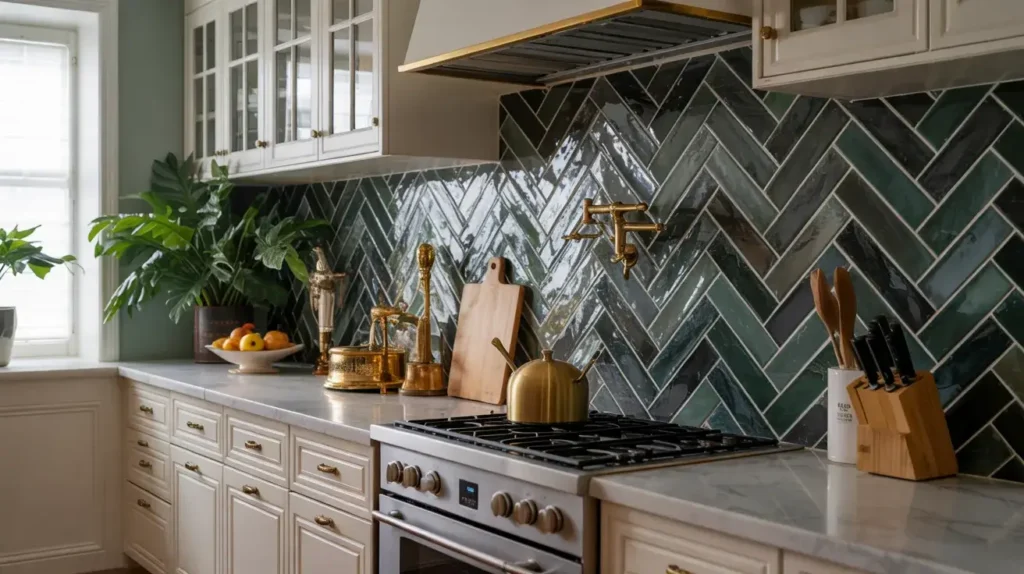
It’s not just about color; it’s about the lay. Herringbone patterns take a standard rectangular tile and turn it into a statement. When you do this in a dark green, you get a texture that looks like a high-end fabric or a beautifully paved path.
The Layout Impact
The zig-zag pattern moves the eye up and down, which creates energy and movement. I love this for a feature wall behind a range hood. However, I have to warn you: labor costs will be higher. Your tiler has to make a lot of 45-degree cuts, and they will probably complain about the math involved. Feed them lunch; it helps.
Styling
- Grout Lines: You must use a contrasting grout (like light grey) if you want the pattern to show. If you use dark grout, the herringbone pattern disappears into the shadows, and you paid extra labor for nothing.
- Scale: Use a longer, thinner tile for a more elegant herringbone. Chunky tiles make the pattern look clunky and short.
7. Green Marble Slab Backsplash
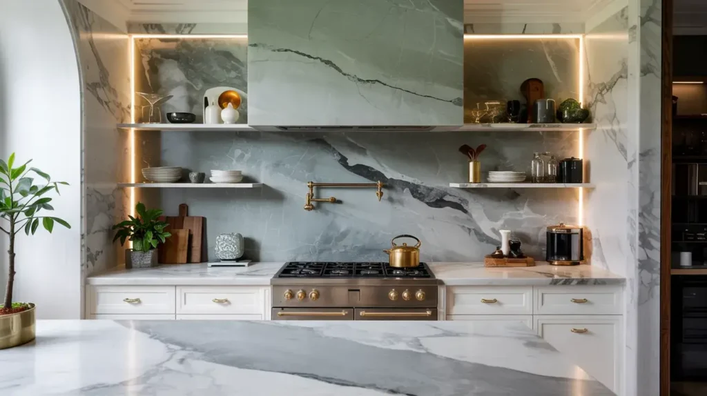
If budget is not a concern—or if you are okay with eating instant noodles for a year to pay for your kitchen—go for a solid Green Marble slab. We are talking about materials like Verde Alpi, Rainforest Green, or Connemara marble. This is the ultimate luxury.
Seamless Beauty
There are no grout lines. None. It is just one continuous piece of natural art. The veining in green marble is usually spectacular, ranging from white lightning strikes to deep black pools. It turns your backsplash into a mural painted by nature.
The Maintenance Reality Check
I have to be the bearer of bad news here. Marble is porous and fussy. If you splash tomato sauce or lemon juice on it and don’t wipe it up immediately, it will etch (dull spots) or stain. You have to seal this annually.
- Is it worth it? Yes, for the look. It’s breathtaking.
- Is it practical? Only if you are diligent about cleaning. If you leave dishes in the sink for three days, skip this.
Styling:
Keep everything else minimal. Flat-panel cabinets, hidden hardware. Let the stone speak.
8. Pistachio Green Retro Tile Style
Pistachio is Mint’s punchier, nuttier cousin. It has a bit more yellow in it, giving it a vibrant, energetic feel. This color is currently having a massive resurgence in Mid-Century Modern renovations.
Embracing the Fun
This is not a serious color. It’s playful. I love seeing this used in square tiles (4×4 or 6×6) stacked in a grid pattern. This grid layout screams “modern retro” and feels very architectural.
Design Elements
- Accessories: This looks amazing with colorful counter appliances, like a Smeg fridge or a colorful KitchenAid mixer.
- Flooring: Terrazzo floors are the perfect match for Pistachio tiles. The speckled floor picks up the green notes beautifully.
Why I Love It:
It takes confidence to use Pistachio. It says you don’t take yourself too seriously and you want your home to be a happy place. Just be sure you really love the color, because it is impossible to ignore.
9. Deep Green Mosaic Tile Pattern
Mosaics aren’t just for swimming pools. A deep green mosaic—think penny rounds, small hexagons, or kit-kat shapes—adds immense texture to a kitchen.
Texture Over Size
Because the tiles are small, you have a lot of grout lines. This creates a visual texture that breaks up the space. In a deep green, it looks like dragon scales or a rich textile. I particularly enjoy “Kit-Kat” (finger) tiles in deep green vertically stacked. It looks architectural, sleek, and slightly Japanese-inspired.
The Grout Warning
I mentioned grout lines, right? You have a lot of them. That means a lot of scrubbing.
- Solution: Use an epoxy grout. It resists stains and water much better than standard sanded grout. Trust me on this; you do not want to be scrubbing spaghetti sauce out of a thousand tiny grout lines with a toothbrush.
10. Soft Green Vertical Stack Tile
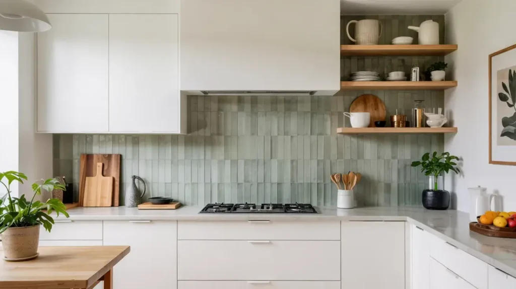
If you want to make your ceilings look higher (and who doesn’t?), stop looking at horizontal layouts. Stack your rectangular tiles vertically. Using a soft, pale green in a vertical stack is the peak of modern minimalist design right now.
Linear Elegance
This layout draws the eye upward. It breaks away from the traditional brick lay, signaling immediately that this is a contemporary, designed space. Soft green keeps it from looking like a hospital; it adds just enough warmth to feel inviting.
Styling for Height
- Shelving: Open shelving in light wood breaks up the vertical lines nicely so it doesn’t look like a jail cell.
- Lighting: Pendant lights with long cords emphasize the verticality.
My Personal Tip:
Use a longer tile, like a 2×8 or 2×10. Short tiles stacked vertically can look a bit jagged and stumpy. The longer lines create a smoother visual flow 🙂
11. Earthy Green Stone Backsplash
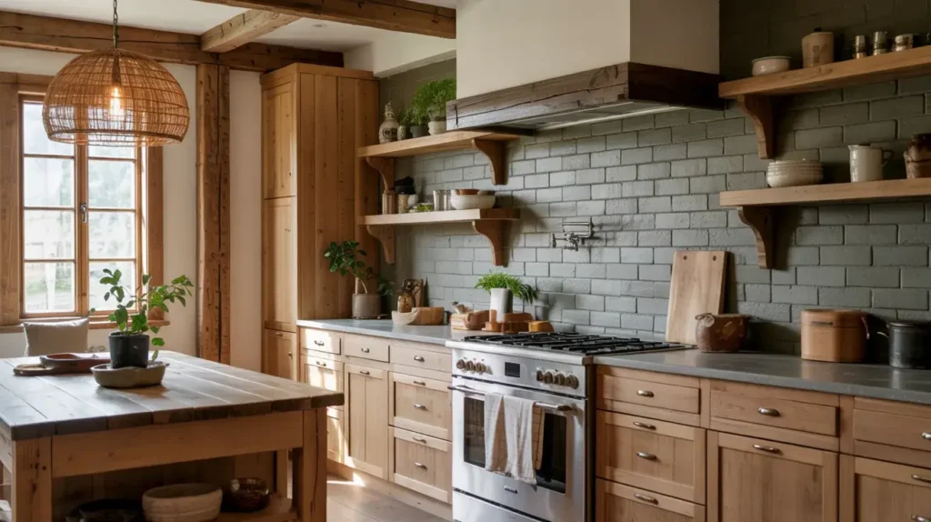
Let’s move away from ceramic and glass for a second. Slate or soapstone with green undertones offers a rugged, earthy appeal that is unmatched. This is for the rustic modern home or the industrial loft.
Natural Variation
Stone is never uniform. You get bumps, ridges, and color shifts from grey to green to charcoal. An earthy green slate backsplash brings the mountains into your kitchen. It feels solid, permanent, and expensive.
Pairing with Woods
This is the best option if you have heavy wood cabinetry, like walnut or reclaimed oak. The stone holds its own against the visual weight of the wood.
- Texture Contrast: Pair rough stone with smooth quartz countertops to avoid texture overload. You don’t want your kitchen to feel like a cave.
FYI:
Stone needs sealing. I know, I sound like a broken record, but you have to protect your investment from grease splatter. Stone is like a sponge until you seal it.
12. Two-Tone Green and White Tile Backsplash
Can’t decide between safe white and bold green? Do both. A checkerboard pattern or stripes can look incredibly chic if handled correctly.
The Checkerboard Revival
Checkerboard is back, baby. Using a muted green and a creamy white in a diagonal checkerboard feels vintage European (think classic French bistro). It adds pattern without needing a complex tile shape.
Striped Layouts
For a more modern look, try random stripes of green within a field of white tiles. It creates a “barcode” effect that is unique and custom.
- Risk: It can look busy or like you ran out of tile.
- Reward: You get a totally unique kitchen that no one else has.
My Advice:
Lay this out on the floor before you glue it to the wall. Once it’s up, it’s up. You need to make sure the pattern balance feels right to your eye.
13. Green Hexagon Tile Statement Wall
Geometrics are still huge in modern design. Hexagons (honeycomb shape) allow for a fun transition. You can actually “feather” the edge of the backsplash so it doesn’t end in a straight line, but rather organically drops off.
The Organic Edge
This works best with a dark green hexagon against a lighter wall paint. You let the tiles fade out, leaving jagged edges. It’s artistic and breaks the rigid, rectangular rules of kitchen design.
Sizing Matters
- Large Hex: Bold, graphic, easier to clean.
- Small Hex: Textured, busy, more grout.
I prefer a larger format hexagon (4-6 inches) for walls. It feels less frantic than the tiny floor mosaics.
14. Muted Green Textured Tile Backsplash
This is different from the Zellige. This is about manufactured texture—tiles that have 3D ridges, waves, or fluting molded into the ceramic. In a muted green, this creates shadows and highlights that change throughout the day.
The Tactile Experience
Kitchens are usually full of hard, flat surfaces (fridge, oven, counter). Adding a fluted tile introduces a tactile element. You want to touch it. The muted green color ensures the shadow play is subtle, not jarring.
Lighting is Critical
You must install downlighting under your cabinets with this tile. The light raking down the textured surface creates the drama. Without proper lighting, the texture looks flat and you basically wasted your money on fancy tile.
15. Green Backsplash with Gold Accent Inlays
Finally, for the maximalist. We are talking about mixing green tiles with actual metallic gold inlay tiles or metal strips (Schluter strips).
The Glamour Look
Imagine a deep emerald wall with thin brass lines running through it horizontally or vertically. It’s Art Deco meets modern luxury. This is a high-impact look that screams opulence.
How to Execute
Don’t overdo the gold. Use it as a border, or random inserts. Less is more here.
- Hardware Match: Your faucet and handles must match the metal inlay perfectly. If the inlay is brushed gold and the faucet is polished brass, it will clash and look cheap.
Final thought on this:
This is a specific taste. It’s not for resale; it’s for you. If you love glam, go for it. Life is too short for boring kitchens.
Conclusion
We have covered a lot of ground here, from the safe harbor of Sage Subway tiles to the wild waters of Gold Inlays. Choosing a Green Backsplash is a commitment, but it is one that pays off in personality and style.
Don’t be afraid of color. Green is uniquely positioned as a color that relaxes us (biophilia is a real thing!) while still providing that design “pop” we all crave. Whether you choose the imperfections of Zellige or the sleekness of glass, the most important thing is that you love it when you walk in to make your coffee at 6 AM.
So, go order some samples. Tape them to your wall. Live with them for a few days in different lighting. And when you finally install that stunning green backsplash, invite me over. I’ll bring the wine (and I promise not to judge your grout lines too harshly).
Happy renovating!