15 Stunning Light Green Kitchen Ideas for Bright Modern Homes
- Kitchen Decor Idea
Admin
- 0
- 40 minutes read
Put down the can of “Chantilly Lace” white paint. Step away from the “Agreeable Gray.” We need to have a serious talk about the state of your kitchen.
For the last decade, we have lived in a world dominated by sterile, hospital-grade white kitchens. Don’t get me wrong, I appreciate cleanliness. But do you really want your home to feel like an operating room? Absolutely not. You want a space that breathes. You want a room that feels fresh, organic, and undeniably modern without losing that cozy “home” vibe.
That is where light green enters the chat.
Light green acts as the perfect neutral. It brings the outdoors in, calms the nervous system, and somehow makes a small space feel massive. I painted my pantry a soft pistachio last year, and I still smile every time I walk in to grab a bag of chips. It transforms the energy of a room completely.
If you are ready to ditch the boring beige and embrace a color that actually has a pulse, you are in the right place. We are going to look at 15 killer ideas to bring light green into your kitchen. FYI, I’m going to get specific with materials and pairings because the devil is in the details.
Let’s get into it.
1. Mint Green Cabinets with White Quartz Countertops
The Ultimate Fresh Start
Nothing screams “clean” quite like mint green. It possesses this retro 1950s charm, yet when you pair it with modern materials, it feels incredibly current.
Why This Pairing Works
Mint green leans cool on the color spectrum. When you slap a slab of crisp white quartz on top of it, you create a seamless, airy transition. White quartz reflects light beautifully, which helps bounce natural light around the room.
Why I Prefer Quartz Over Marble Here:
- Durability: Mint green looks playful. You don’t want to ruin that vibe by stressing over lemon juice etching your counters. Quartz takes a beating and keeps looking new.
- Consistency: The solid color of quartz prevents the design from looking too busy.
Styling Tip:
Keep your hardware silver or chrome. It enhances the “cooling” effect of the mint. If you use gold here, it might look a bit too much like an Easter basket. Stick to cool metals for a sleek, modern edge.
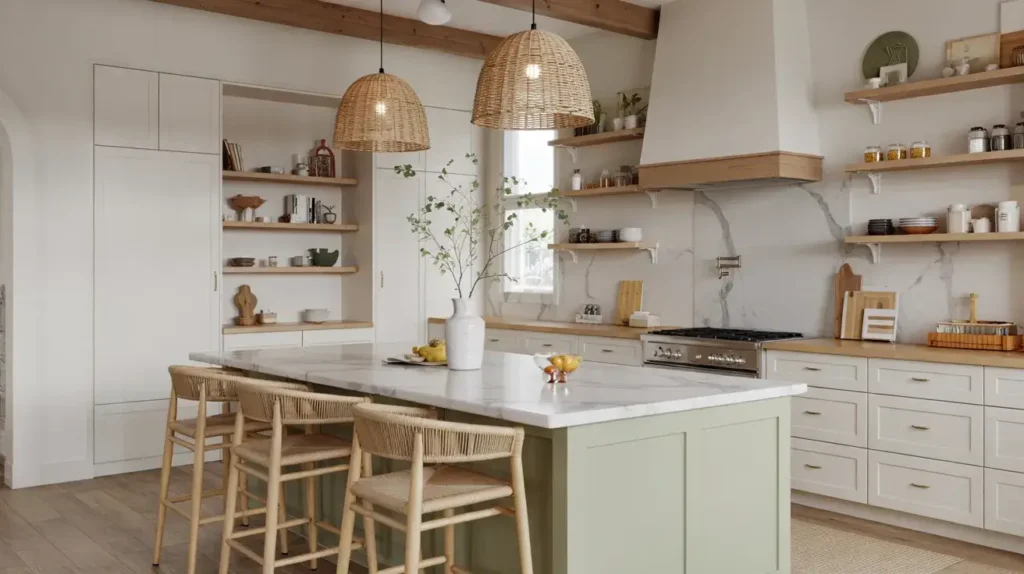
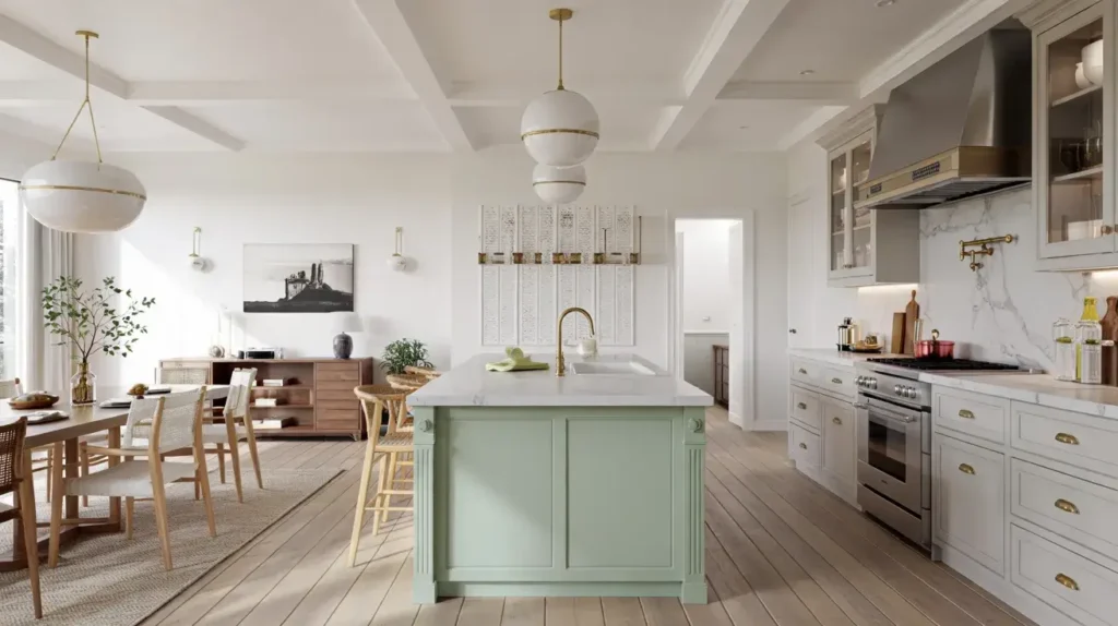
2. Sage Green Kitchen Island with Light Wood Accents
Grounding the Room
Maybe you feel terrified of painting your entire kitchen green. I get it. Commitment issues are real :/.
The solution? The statement island.
Paint your perimeter cabinets a safe cream or white, but saturate that island in a lovely, earthy sage green. Sage acts as a bridge between the indoors and the outdoors. It feels sophisticated, not childish.
Incorporating the Wood
You need to introduce light wood elements to stop the sage from feeling too “muddy.” Think about:
- Barstools: Light oak or ash stools with clean lines.
- Trim: A light wood trim around the base of the island.
- Accessories: A massive wooden fruit bowl sitting right in the center.
My Experience:
I helped a friend do this in her rental. We couldn’t paint the main cabinets, so we just bought a freestanding island and painted it sage. The room instantly felt 100% more expensive. It draws the eye to the center of the room and makes the space feel curated.
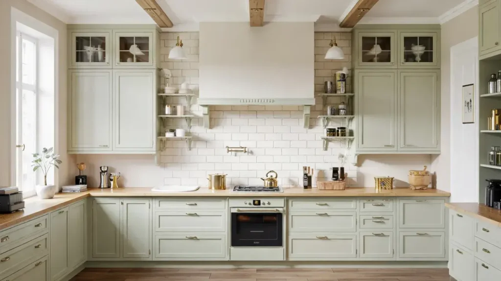
3. Pastel Green Shaker Cabinets and Marble Backsplash
The Definition of Luxury
If you want your kitchen to look like it belongs in a magazine, this is the route you take. Pastel green softens the room, while the shaker style adds architectural interest. But the real MVP here is the marble.
Choosing the Right Marble
You want a marble with warm veining. Look for Calacatta Gold or a Carrara with subtle brown undertones. The grey/gold veins cut through the sweetness of the pastel green and add some serious maturity to the palette.
Why Shaker Style?
- Shadow Lines: The recessed center panel of shaker doors catches shadows. This adds depth to the pastel paint, so it doesn’t look flat or cheap.
- Timelessness: Shaker cabinets never go out of style.
A Warning on Marble:
Marble stains. It just does. If you cook with a lot of turmeric or red wine, you might want to consider a porcelain slab that looks like marble. But IMO, nothing beats the touch and temperature of real stone. Just seal it often!
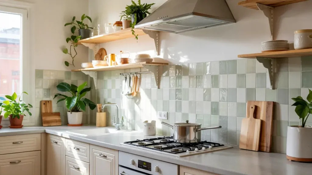
4. Soft Green Backsplash with Floating Wooden Shelves
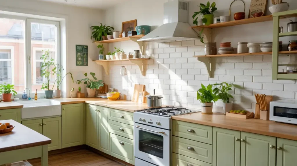
Open, Airy, and Artistic
Sometimes, you love your white cabinets. That’s fine. You can still get the green vibe by focusing on the walls.
Install a soft green tile backsplash that runs from the countertop all the way to the ceiling. Then, disrupt that wall of color with chunky, floating wooden shelves.
The Visual Impact
This technique forces the eye upward. It makes low ceilings feel higher because you don’t have heavy upper cabinets closing in on you. The wood shelves add warmth and texture against the glossy or matte tile.
What to Put on the Shelves?
- Ceramics: White or cream plates look stunning against green tile.
- Glassware: Clear glass keeps the look light.
- Art: Lean a small framed print against the wall.
Rhetorical Question:
Who actually needs 50 mugs? Nobody. Open shelving forces you to declutter and keep only the things you actually use and love. It’s basically forced minimalism, and I love that for you.
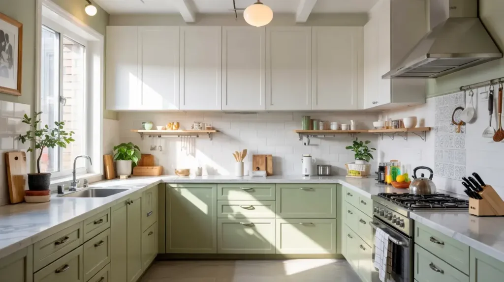
5. Light Green Lower Cabinets with Cream Upper Cabinets
The Two-Tone Trick
This is one of the oldest tricks in the designer handbook for a reason: it works.
By painting your lower cabinets a light green and your upper cabinets a soft cream, you ground the space without making it feel heavy. Dark colors (even light green has weight) belong on the bottom. Light colors belong on top.
Why Cream instead of White?
Stark white can feel too harsh against a soft, organic green. Cream has yellow undertones that harmonize beautifully with green. It feels warmer and more inviting.
Best Applications:
- Small Kitchens: This makes the room feel twice as big.
- Low Light Rooms: The cream uppers reflect whatever light you have, brightening the space.
Personal Anecdote:
I saw this done in a galley kitchen in New York City. Before the paint job, the kitchen felt like a cave. After they painted the lowers green and uppers cream, it felt like a sunroom. It’s a game-changer for tight spaces.
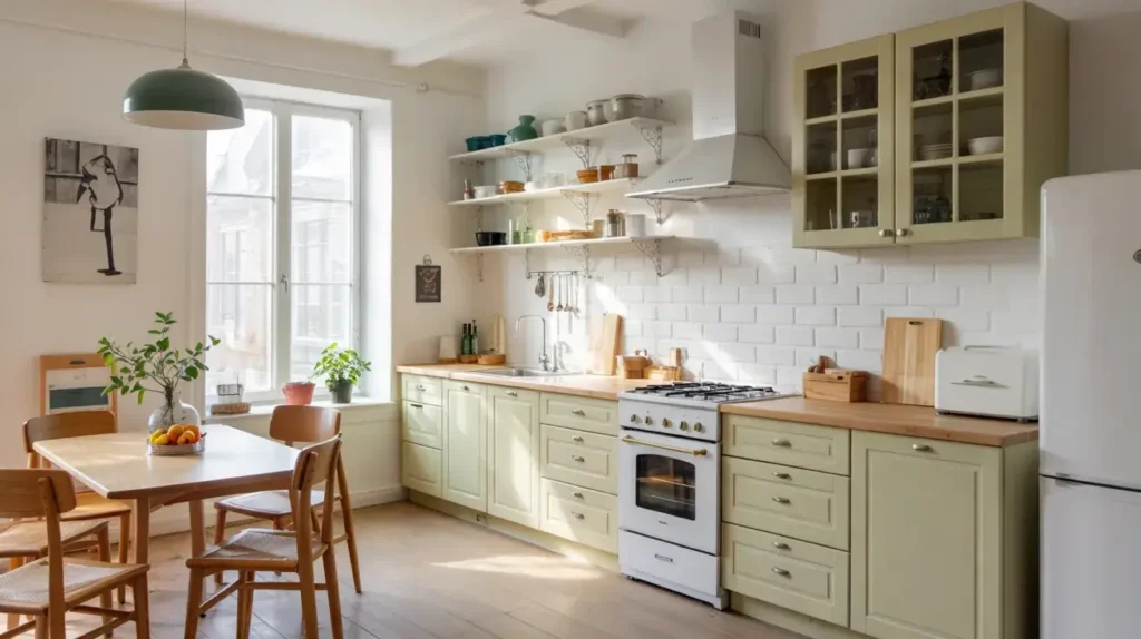
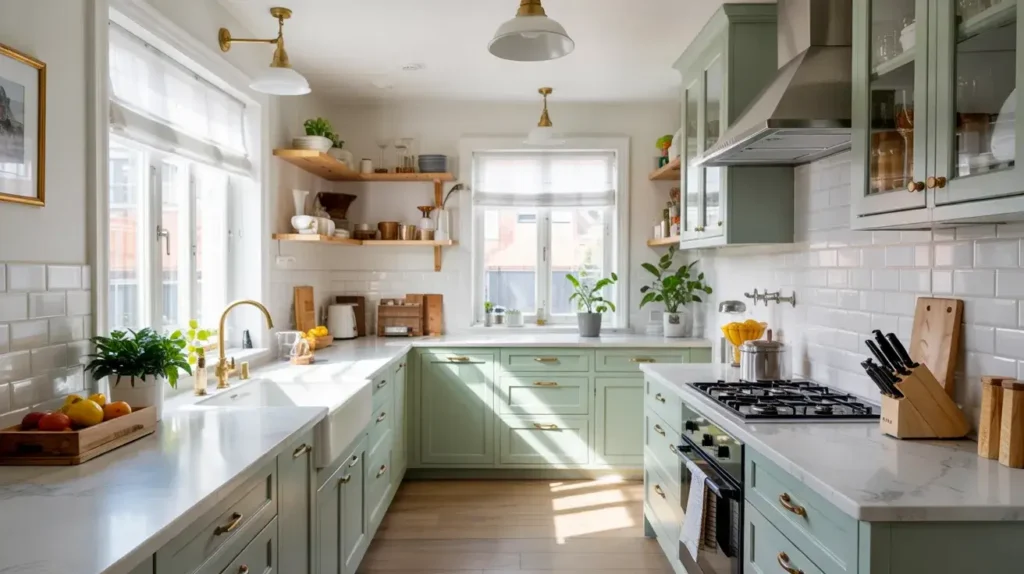
6. Pale Green Scandinavian Style Kitchen
Minimalist perfection
The Scandinavians know how to do two things exceptionally well: survive winter and design kitchens.
A Scandi-style kitchen focuses on function, clean lines, and light. A pale, almost translucent green fits this aesthetic perfectly. It offers just a hint of color—a whisper, really—without disrupting the Zen vibe.
Key Features to Include
- Flat-Front Cabinetry: No fancy molding. Just smooth, flat doors.
- Hidden Hardware: Use push-to-open latches or integrated finger pulls.
- Blonde Woods: Mix the pale green with birch or light maple flooring.
Lighting is Everything:
In this style, you need excellent lighting. I suggest modern pendant lights with a matte white finish. They blend in rather than stand out, keeping the focus on the soothing color palette.
This style works best if you hate clutter. If you are the type of person who leaves the mail on the counter for three weeks, this ultra-clean look might stress you out. But if you crave order? It’s paradise.
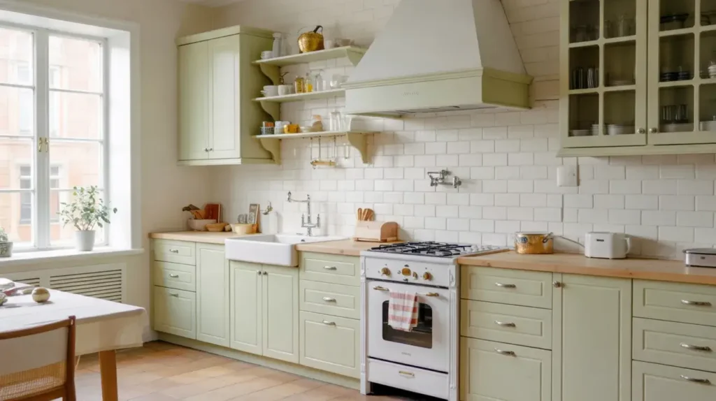
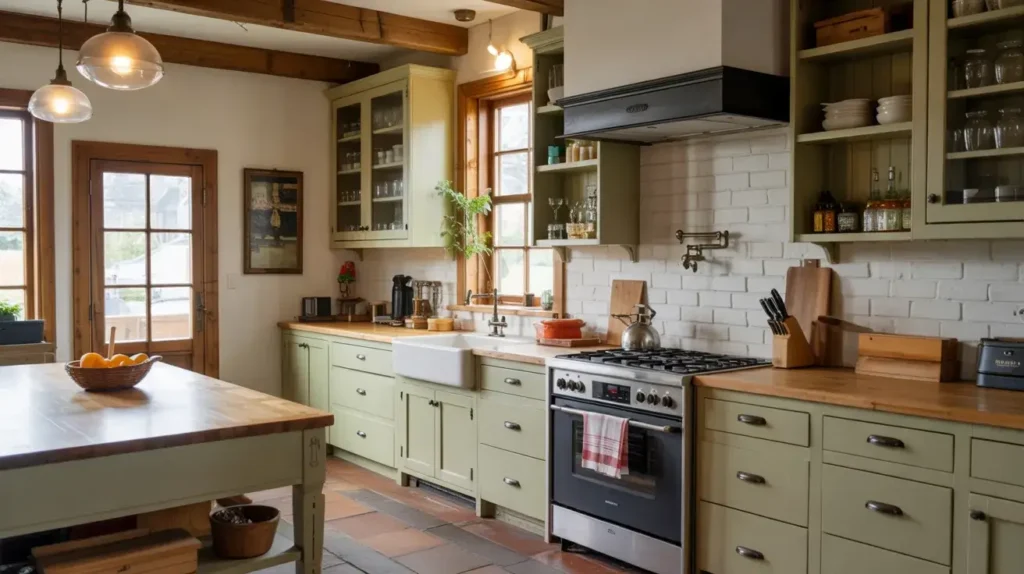
7. Light Green Cabinets with Butcher Block Counters
The Cozy Cottage Vibe
Do you want your kitchen to feel like a warm hug? Then you need butcher block.
Pairing light green cabinets with wood countertops creates an instant “English Cottage” feel. It’s rustic, unpretentious, and incredibly welcoming.
The Financial Upside
Let’s be real about money. Butcher block is cheap. It costs a fraction of what quartz or marble costs. If you are renovating on a tight budget, this combo saves your wallet while still looking high-end.
Maintenance Reality Check:
You have to oil these counters. You cannot cut raw chicken directly on them (please don’t). You have to wipe up spills immediately.
My Advice:
Use a Waterlox sealer on the wood. It makes the surface waterproof and food-safe. I used this on a prep table years ago, and water beaded right off. It saves you from the anxiety of water rings.
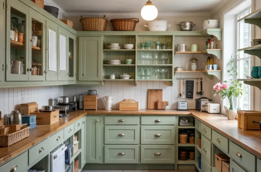
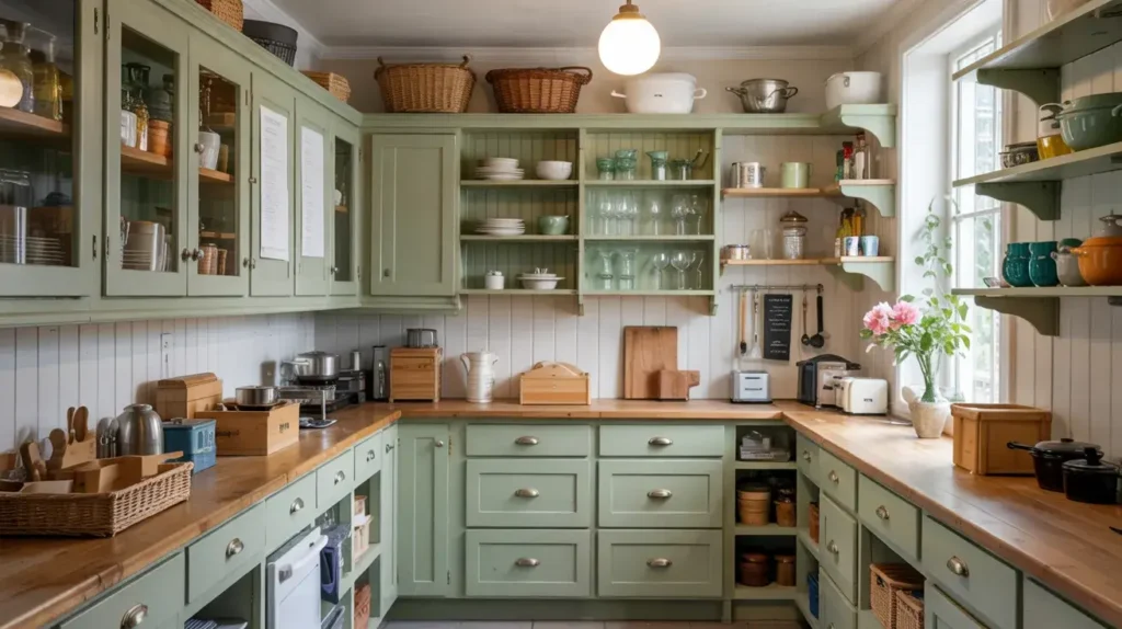
8. Soft Green Pantry with Glass Cabinet Doors
The Jewel Box Effect
Maybe you want to keep the main kitchen neutral. Fine. But let’s go wild in the pantry or a specific section of cabinetry.
Paint the interior and exterior of a pantry section soft green. Then, install glass doors.
Why Glass?
The glass allows you to see the beautiful color inside the cabinet. It turns your dishware into a display. It adds depth to the room because your eye travels into the cabinet rather than stopping at the door.
Styling the Interior:
- Paint the Shelves: Don’t leave the shelves white! Paint them the same green as the frame.
- Lighting: Install LED strip lights inside the cabinet vertically. It makes the green glow at night.
Humor Alert:
This only works if you own matching plates. If your cabinet is full of souvenir cups from plastic theme parks and mismatched Tupperware without lids, maybe stick to solid doors. We don’t need to put the chaos on display.
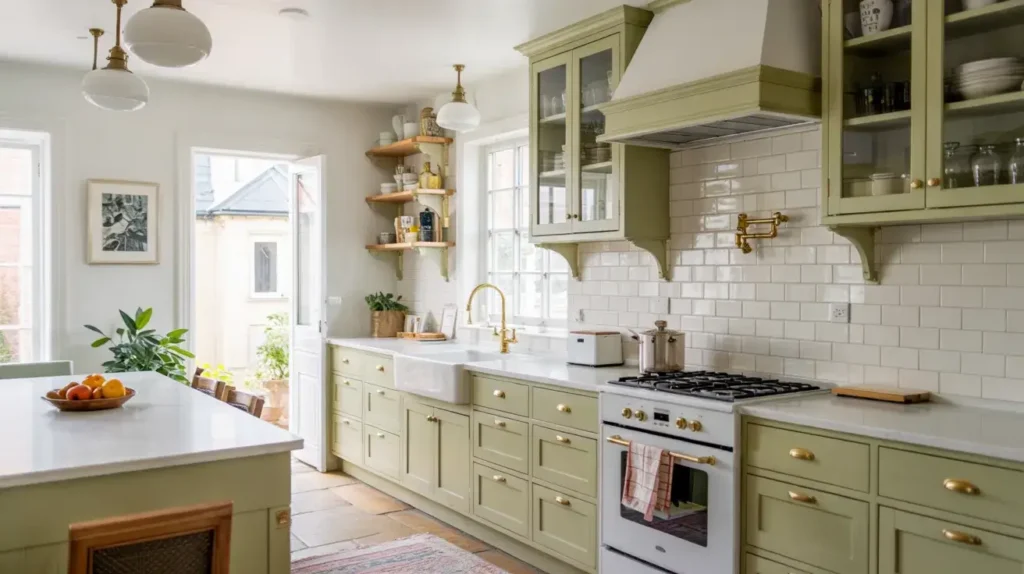
9. Mint Green Kitchen Island with Brass Hardware
Jewelry for Your Kitchen
We talked about mint and chrome earlier. Now, let’s talk about mint’s fancy cousin: Mint and Brass.
Unlacquered brass hardware on a mint green island looks stunning. The warm, gold tones of the brass contrast sharply with the cool mint. It feels vintage and expensive.
Choosing the Right Brass
- Satin Brass: Soft, matte, and modern.
- Unlacquered Brass: Develops a patina over time. It gets darker and grungier (in a good way) as you touch it.
- Polished Brass: Very shiny. Can look a bit 1980s if you aren’t careful.
Coordinate the Faucet:
If you go with brass pulls on the island, make sure your kitchen faucet matches. Mixed metals can work, but for this specific look, a matching brass bridge faucet pulls the whole aesthetic together.
10. Two-Tone Light Green and White Modern Kitchen
The Color Block
Modern design loves geometry. You can use light green to create distinct “zones” in your kitchen.
Instead of top vs. bottom, think vertical blocking. Maybe the entire wall of tall pantry cabinets is light green, while the island and sink run are stark white.
Visual Separation
This technique defines functions. The green area holds the food (fridge/pantry), and the white area handles the work (prep/cleaning).
Why This looks Modern:
- Asymmetry: It isn’t perfectly balanced, which makes it dynamic.
- Clean Lines: It treats the cabinets as blocks of color rather than furniture.
Design Tip:
Keep the backsplash neutral. Let the blocks of color do the talking. A simple sheet of back-painted glass or a slab of white stone works best here. Tile grout lines might make it look too busy.
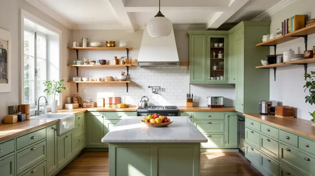
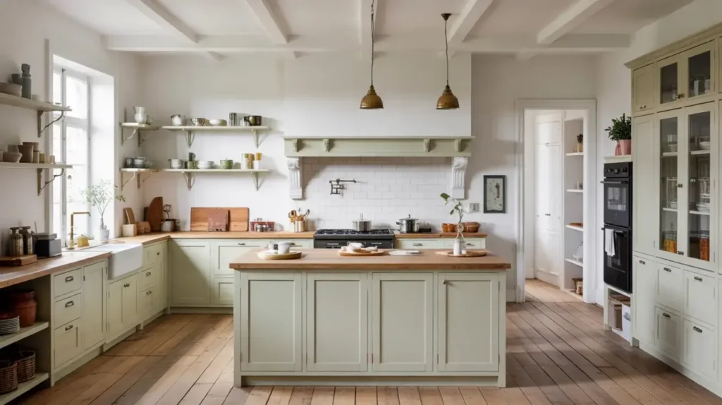
11. Light Green Cabinets with Natural Wood Flooring
The Foundation
This is one of the most critical relationships in your kitchen: The Floor vs. The Cabinets.
Light green cabinets sit beautifully on top of natural, medium-tone wood floors. The green pulls out the warmth in the wood grain.
Choosing the Floor Stain
- White Oak: The holy grail. It’s light, airy, and looks perfect with pastel greens.
- Walnut: A higher contrast look. The dark floor makes the light green pop, but it can darken the room.
- Avoid Red Tones: Try to avoid cherry or mahogany floors with light green. The red and green contrast creates a Christmas vibe that you probably don’t want year-round.
Rhetorical Question:
Ever notice how a room feels colder when the floor is tiled? Wood brings physical and visual warmth. If you have light green cabinets, you need that wood floor to anchor them so the room doesn’t feel like a floating cloud.
12. Pastel Green Kitchen with Open Shelving and Plants
Biophilic Design (aka Plant Lover’s Paradise)
Light green is the color of nature. Lean into that.
Fill your kitchen with plants. Place them on top of the fridge, on open shelves, and on the windowsill. The live greenery connects visually with the painted pastel green cabinets, creating a layered, monochromatic texture.
Best Kitchen Plants
Kitchens have fluctuating temperatures and humidity. You need survivors.
- Pothos: Basically unkillable. Trailing vines look great on shelves.
- Snake Plant: Needs very little light or water.
- Herbs: Basil or mint on the windowsill. Functional and pretty.
Why It Works:
The variety of greens—from the pale paint to the deep forest green of a snake plant leaf—adds complexity to the design. It proves that you don’t need a thousand different colors to make a room interesting; you just need different shades of one color.
13. Soft Green Cabinets with Subway Tile Backsplash
The Classic That Never Fails
Subway tile gets a bad rap for being “basic.” I disagree. It’s classic. It’s the white t-shirt of interior design.
When you pair a standard 3×6 white subway tile with soft green cabinets, you create a look that will still look good in 20 years.
The Twist: Grout Color
Here is where you make it modern. Do not use white grout.
- Use Light Grey Grout: It highlights the brick pattern of the tile.
- Maintenance: White grout turns yellow/orange near the stove (thanks, spaghetti sauce). Grey grout hides the grime.
Texture Variation:
Instead of standard machine-made subway tile, look for “hand-made” look tiles. They have uneven edges and a wavy surface. This texture reflects light differently and makes the simple white-and-green combo feel custom and expensive.
14. Light Green and Wood Minimalist Kitchen
Zen and the Art of Cooking
This is similar to Scandi, but warmer. We call this “Japandi” (Japanese + Scandi).
Combine muted light green cabinets with slat-wood details. Think vertical wood slats on the back of the island or a wood-slatted ceiling.
The Philosophy
Everything must have a place. The countertops should be empty. The appliances should be integrated (hidden behind cabinet panels).
Material Focus:
- Matte Paint: No gloss. You want the green to absorb light, creating a soft, velvet-like appearance.
- Bamboo or Ash: Use these woods for the accents. They are sustainable and have a beautiful, straight grain.
My Opinion:
This creates the most relaxing kitchen environment possible. If you have a chaotic job or a loud family, this kitchen becomes your sanctuary of silence. It forces you to slow down.
15. Bright Green Cabinets with Light Marble Countertops
The Energy Boost
Let’s end with a bang. Sometimes “light” green doesn’t mean “pale.” It can mean bright.
Think of a Granny Smith apple or a new spring leaf. This color is energetic, bold, and happy.
Balancing the Brightness
Because the color is so intense, you need to calm it down with the countertops. A cool, white marble with heavy grey veining is the perfect dampener. It adds sophistication to a color that could otherwise feel juvenile.
Where to use this:
- Laundry Rooms: Okay, not a kitchen, but it works.
- Pool House Kitchens: Fun and vibrant.
- Main Kitchen: If you have a ton of natural light.
Styling:
Keep the walls white. If you paint the walls green and the cabinets bright green, you will feel like you are living inside a lime. Let the cabinets be the star of the show.
Final Thoughts: Go Green or Go Home
We have covered a lot of ground here. From the soothing vibes of sage and oak to the high-energy punch of bright green and marble.
Here is the takeaway: Light green is versatile. It plays nice with wood, brass, chrome, marble, and quartz. It fits in a 100-year-old farmhouse and a brand-new city apartment. It is forgiving, relaxing, and undeniably stylish.
If you are standing in the paint aisle staring at 50 shades of beige, do yourself a favor. Turn around. Walk to the green section. Grab a sample of “Pistachio,” “Sage,” or “Mint.” Put it on your wall.
I promise, once you see how the morning sun hits that green, you will never want a white kitchen again.
Now, go grab a roller and start painting. Your kitchen is begging for a glow-up. 🙂