15 Beautiful Pink and Green Kitchen Ideas to Inspire Your Home
- Kitchen Decor Idea
Admin
- 0
- 46 minutes read
Look, I get it. You stare at your kitchen, and you see a sea of white. Maybe gray if you felt “adventurous” five years ago. We’ve all been there. You scroll through Pinterest or Instagram, and everything looks the same: clean, sterile, and frankly, a little boring. You’re here because you want something different. You want life. You want flavor. You want a space that actually makes you smile when you walk in to brew your morning coffee.
And honestly? You want pink and green.
I know what you might be thinking. “Pink and green? Doesn’t that look like a watermelon exploded?” Absolutely not. (Well, not if you do it right). When you pair these two colors correctly, you get a combination that feels organic, fresh, and surprisingly sophisticated. Nature uses this combo all the time—think roses on a bush, a lotus on a pond, or a rhubarb stalk. If Mother Nature approves, who are we to argue?
I’ve spent way too much time obsessing over color palettes, renovating spaces, and arguing with contractors about paint swatches, and I can tell you that this duo offers versatility that monochrome kitchens just can’t touch. Whether you want moody and dramatic or soft and airy, this pairing delivers. It strikes a balance between the warmth of the red family (pink) and the grounding, calming nature of the earth tones (green).
So, forget the safety of “Greige.” Put down the catalogue of fifty shades of white. Let’s look at 15 Beautiful Pink and Green Kitchen Ideas to Inspire Your Home that will actually make you want to cook dinner tonight.
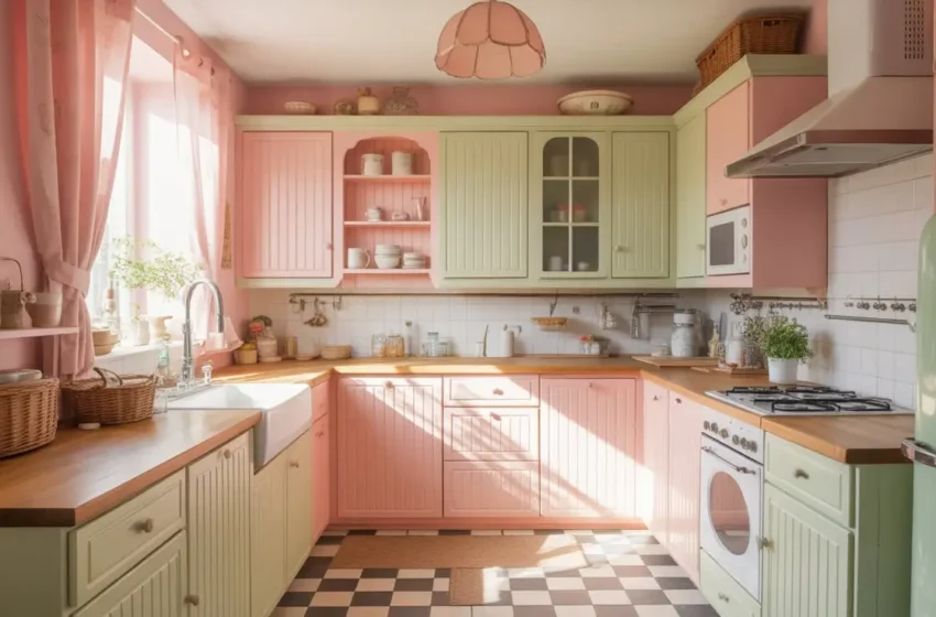
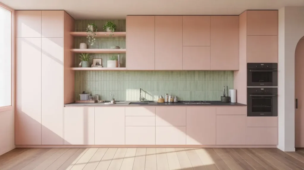
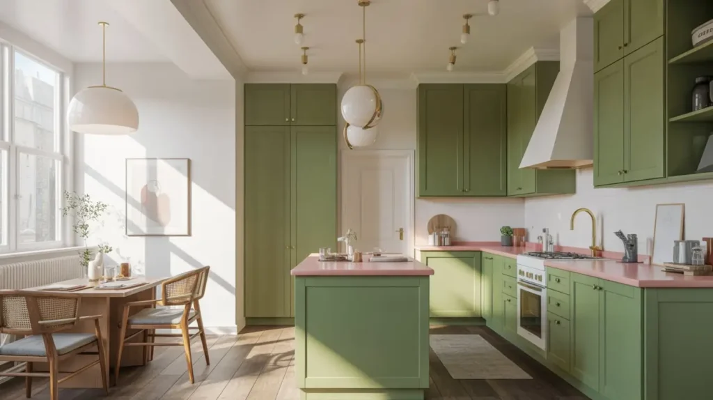
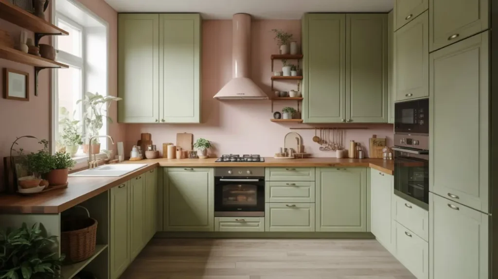
1. Blush Pink Cabinets with Sage Green Accents
Let’s start with the gateway drug of color combinations. You might feel nervous about painting your entire kitchen pink. That’s fair. It’s a commitment. But blush pink acts almost like a neutral in modern design. It’s warm, inviting, and doesn’t scream “Barbie Dreamhouse” if you pick the right shade.
When you pair soft blush cabinetry with sage green accents, you create a space that feels incredibly calming. I usually suggest keeping the sage green for the smaller elements to anchor the room without darkening it. Think about a sage green backsplash, open shelving, or even just upholstered bar stools.
Why this works:
- Balance: The warmth of the pink balances the cool, earthy undertones of the sage. It creates a “yin and yang” effect that feels settled.
- Light: Blush pink reflects light beautifully. If you have a small galley kitchen or a space with only one window, this color makes the walls recede and the room feel bigger.
- Versatility: You can swap out the green accents later if you get bored (though I doubt you will).
Design Detail: Matte finishes look best here. Glossy blush pink can look a bit cheap or reminiscent of nail polish, but a matte finish looks high-end, velvety, and sophisticated. Pair this with light oak flooring to keep the vibe organic and airy.
2. Soft Pink Walls with Deep Green Lower Cabinets
Do you want to ground your space? This is the way to do it. Painting your lower cabinets a deep, forest green creates a solid foundation for the room. Then, you keep the upper half light and airy by painting the walls a soft pink.
I love this look because it’s practical. Let’s be real; lower cabinets take a beating. Scuff marks from shoes, spilled tomato sauce, the dog running into them with a toy—dark green hides all sins. The soft pink walls keep the room from feeling like a cave, which is a risk when you use dark cabinetry.
Key Design Elements:
- Visual Weight: Dark colors on the bottom anchor the room. It feels architectural and deliberate.
- Openness: Light pink walls draw the eye upward, creating an illusion of height. If you have low ceilings, this trick works wonders.
- Flexibility: Painting walls is easier than painting cabinets. If you tire of the pink in five years, you just repaint the walls cream or white and keep the gorgeous green cabinets.
Hardware Note: Use satin brass hardware with this combo. The gold tones pop against the deep green and compliment the warmth of the pink walls perfectly. IMO, silver or chrome hardware just looks too cold here; you want that warm, vintage gold glow.
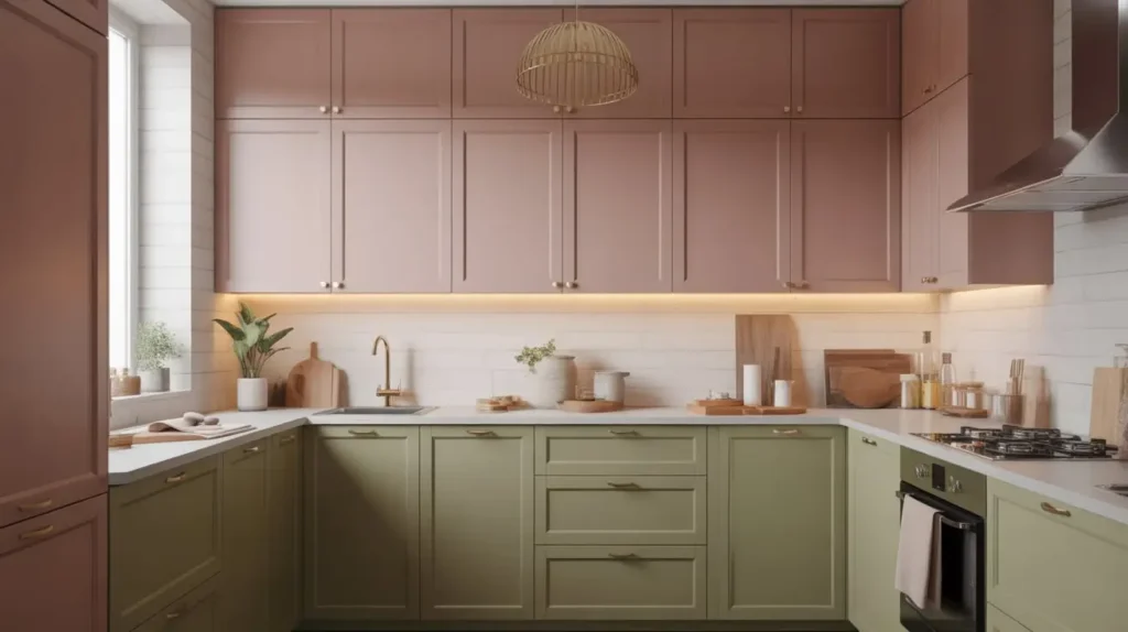
3. Dusty Rose and Olive Two-Tone Kitchen
If you prefer an earthier, more vintage vibe, you need to look at dusty rose and olive. This isn’t the bright pastel kitchen of an ice cream parlor; this is the kitchen of a cool aunt who collects pottery, grows her own herbs, and makes her own sourdough.
Two-tone cabinetry is a massive trend, and for good reason. It breaks up the monotony of a single color. I suggest using olive green for the island or the tall pantry units, and dusty rose for the main run of cabinets (or vice versa). The dusty quality of these specific shades means they have grey undertones, which makes them feel mature rather than juvenile.
The “Earthy” Checklist:
- Material: Use natural wood accents (like butcher block countertops or walnut shelves) to bridge the two colors. The wood grain unites the green and pink.
- Texture: Incorporate terracotta pots, woven baskets, or a jute rug. This look relies on texture to feel “lived-in.”
- Lighting: Warm, ambient lighting makes these colors glow at night. Avoid cool white LEDs; they will strip the warmth right out of the rose.
FYI: Olive green can sometimes read as brown in low light. Test your paint samples at different times of the day (morning, noon, and night) before you commit to five gallons of it! You want to ensure it stays green, not muddy.
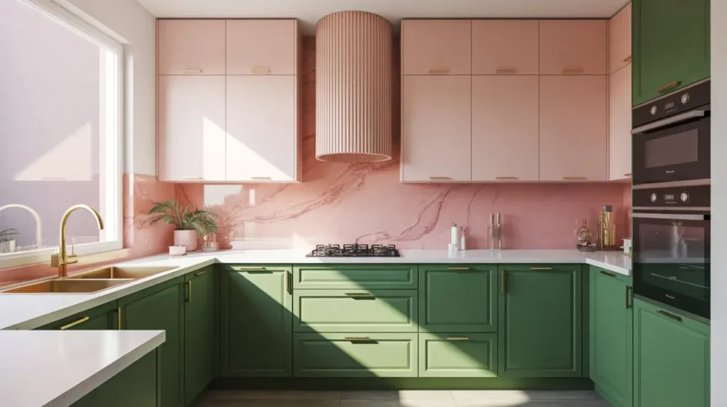
4. Pink Marble Backsplash with Emerald Green Cabinets
Okay, are you ready to feel fancy? Because this combination screams luxury. Emerald green cabinets provide a rich, jewel-toned backdrop that feels regal. But the real star here is the pink marble.
Now, I know what you’re thinking. “Marble? In this economy?” But hear me out. You don’t need to slab the entire wall. A pink marble (or a pink-veined quartz, which is more durable) backsplash adds incredible texture and pattern without requiring a second mortgage. The veins in the stone tie the whole look together.
Why I love this:
- Contrast: The chaotic, organic veining of the marble breaks up the solid blocks of saturated green color.
- Elegance: Emerald green is inherently sophisticated; pink marble pushes it into “hotel bar” territory. It feels expensive.
- Uniqueness: Most people choose white Carrara marble. Pink marble (like Rosa aesthetic) shows you have a distinct style and aren’t afraid to use it.
If real stone breaks the bank or scares you because of maintenance (lemon juice vs. marble is a losing battle), look for large-format porcelain tiles that mimic the look of pink onyx or marble. You get the look without the panic attack every time someone spills red wine.
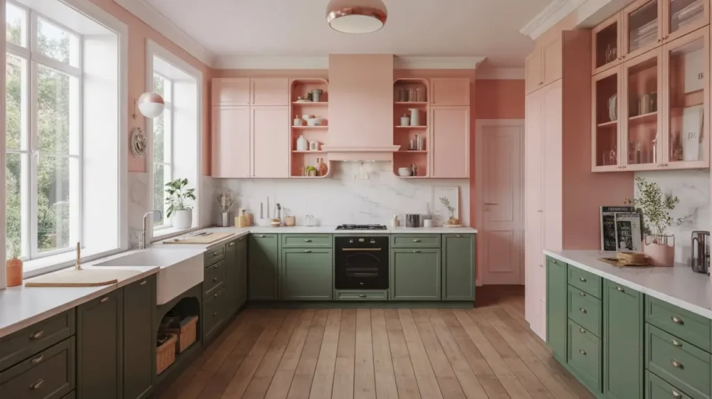
5. Pale Pink Kitchen with Green Tile Feature Wall
Sometimes, you want the color to come from the architecture, not just the paint. In this setup, you paint the cabinets a very pale, barely-there pink. It reads as a neutral until you get close. Then, you create a massive focal point with a green tile feature wall.
I’m talking floor-to-ceiling tile behind the range hood or around a window. Use a tile with some variation in color—like a handmade Zellige tile—where the greens shift from moss to seafoam to emerald. This shimmering wall becomes the jewelry of the kitchen.
Execution Tips:
- Grout Color: Use a light grey or off-white grout to make the green tiles pop. Dark grout might make it look too busy.
- Cabinet Tone: Ensure the pink is subtle enough that it doesn’t fight with the tile. You want the eye to go to the wall first.
- Simplicity: Keep the countertops neutral. White quartz is your friend here. You don’t want the counter competing with that glorious wall.
Have you ever walked into a room and immediately known where to look? That’s what a feature wall does. It directs the eye, defines the space, and makes the room feel structured.
6. Green Shaker Cabinets with Pink Quartz Countertops
We usually think of countertops as the neutral element—white, black, or grey. But why not pink? Pink quartz or terrazzo countertops are having a serious moment right now. They are durable, stain-resistant, and incredibly fun.
When you pair a pink surface with classic green Shaker-style cabinets, you blend the traditional with the playful. The Shaker style brings the history and the structure, while the pink countertop brings the personality. It’s a twist on the traditional country kitchen.
Choosing the right Quartz:
- Solid vs. Pattern: A solid pink reads very retro (think 1950s diner), which is a vibe if that’s what you want. However, a speckled terrazzo or veined quartz looks more modern and architectural.
- The Green Shade: Stick to a mid-tone green here. Too dark, and the contrast is too harsh. Too light, and it washes out against the counter. A nice “grass green” or “fern green” works well.
I recently saw a kitchen with hunter green cabinets and a chunky pink terrazzo countertop containing large aggregate chips, and it stopped me in my tracks. It felt robust and joyous at the same time.
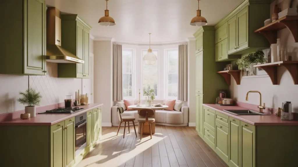
7. Pastel Pink and Mint Scandinavian Kitchen
Scandi style doesn’t have to mean boring white and wood. The Scandinavian aesthetic embraces color, provided you keep it soft, functional, and clean.
Think pastel pink and mint green. This combo works exceptionally well in smaller kitchens or apartments because light colors reflect light and make the space feel airy. The key here is minimalism. You don’t want clutter. You want sleek lines, flat-panel cabinets (no ornate molding), and hidden handles.
How to Scandi-fy it:
- Wood Tones: You must incorporate light woods like birch, ash, or blonde oak. Maybe open wooden shelves against a mint wall, or a light wood dining table.
- Matte Everything: No shine. Matte cabinets, matte tiles. The Scandi look is soft, not glossy.
- Functionality: Keep the counters clear. The colors provide the decoration, so you don’t need knick-knacks.
This look makes me want to drink tea and read a book :/) It’s just so peaceful. It’s perfect for the person who wants a happy kitchen but gets overwhelmed by dark or bold colors.
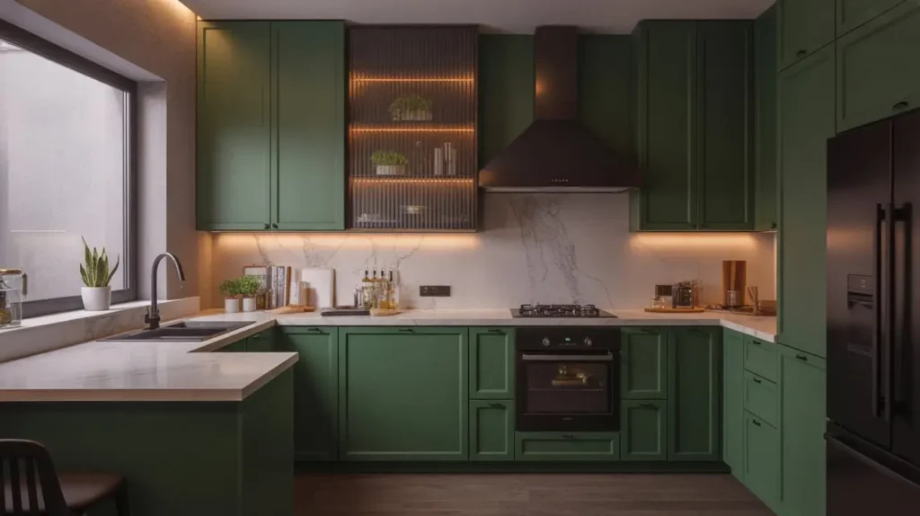
8. Moody Green Kitchen with Warm Pink Highlights
Let’s flip the script. Instead of light and airy, let’s go dark and moody. Paint the walls, the cabinets, and maybe even the ceiling a dark, moody green. I’m talking about a green so dark it almost looks black or charcoal at night.
Then, you bring in the pink. But not just any pink—you use warm, terracotta-leaning pinks for the highlights. Think pink velvet barstools, a pink rug runner, or a collection of pink ceramic vases on a shelf. The pink acts as the “fire” to the green’s “forest.”
The Drama Factor:
- Lighting: You need strategic lighting. Under-cabinet lights and pendant lamps are crucial so the room doesn’t feel like a dungeon. You want pools of light to highlight the pink accents.
- Texture: Use rich fabrics for the pink elements. Velvet or wool adds to the cozy, moody vibe.
- Metals: Aged brass or copper looks incredible against dark green. It adds a sense of history.
This kitchen isn’t for the faint of heart. It’s for the person who hosts dinner parties that last until 2 AM. It feels like a private club or a speakeasy.
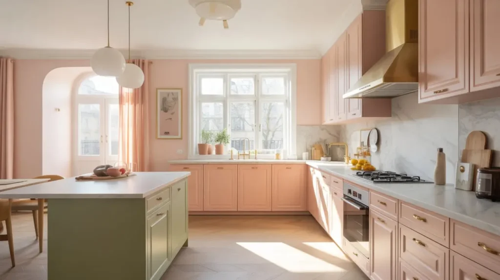
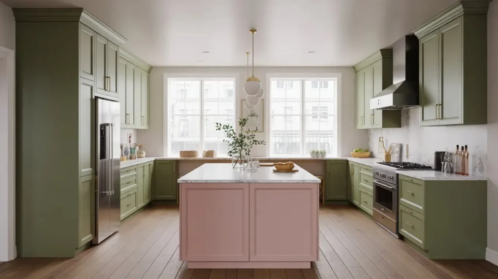
9. Pink Island with Forest Green Perimeter Cabinets
If you fear commitment, the kitchen island is your loophole. You keep the main perimeter cabinets a classic, safe forest green. Then, you paint just the island a bold, punchy pink.
The island acts as a piece of furniture. It’s the centerpiece. If you hate it in three years, you only have to repaint one thing (the island) rather than the whole kitchen. But I promise, you won’t hate it. It creates a dynamic focal point that draws people into the kitchen to gather around.
Why separates work:
- Definition: It separates the “work zone” (perimeter) from the “social zone” (island).
- Fun: It allows you to use a brighter pink (like a coral or bubblegum) that would be overwhelming on all the cabinets.
- Customization: You can treat the island differently—maybe give it a different countertop material, like butcher block, to further distinguish it from the rest of the kitchen.
Bold Move: Use a pink that has orange undertones (coral) rather than purple undertones (lilac). It feels appetizing and warm, which is exactly what you want around food.
10. Vintage Pink and Green Cottage Kitchen
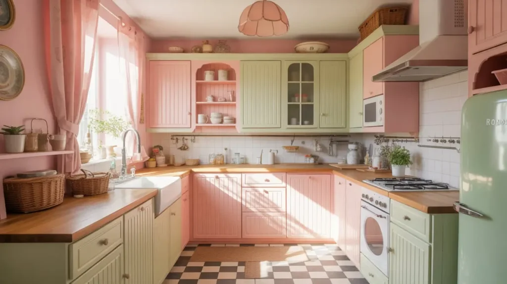
Does the “Cottagecore” trend speak to your soul? Do you want your kitchen to feel like a grandmother’s hug? Then you need the vintage cottage look.
This style relies on nostalgia. We aren’t looking for sleek lines here. We want beadboard detailing, glass-front cabinets, and vintage hardware. Use a dusty sage green for the woodwork and a soft, powdery pink for the walls or accents.
The Nostalgia Kit:
- Fabrics: Use floral curtains or seat cushions that incorporate both pink and green. Gingham patterns also work wonders here.
- Accessories: Display vintage Pyrex, copper pots, or floral plates. Open shelving is great for this—show off your collection!
- Sink: A ceramic farmhouse sink (apron front) is practically mandatory for this look. It anchors the vintage aesthetic.
I love this style because it doesn’t take itself too seriously. It feels lived-in and comfortable from day one. It invites you to bake cookies, not just heat up takeout.
11. Modern Pink Gloss Cabinets with Matte Green Details
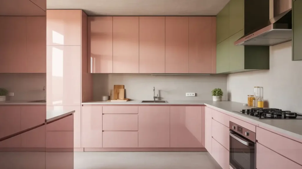
Okay, let’s leave the cottage and head to the city. If you want ultra-modern, you play with finishes. High-gloss pink cabinets look sleek, futuristic, and incredibly chic. They reflect light and make the space feel high-energy.
To keep it from looking like a cosmetic counter, you ground it with matte green details. Maybe matte green pendant lights, matte green dining chairs, or a matte green faucet. The contrast between the hyper-shiny surface and the flat, light-absorbing surface creates visual tension that is super interesting.
Why finish matters:
- Reflection: Gloss cabinets bounce light around. If you have a small city apartment, this makes it feel larger.
- Cleanliness: Gloss is actually easier to wipe down (though it shows fingerprints more). Just a quick wipe with a microfiber cloth and you’re good.
- Contrast: Texture is just as important as color. Shiny vs. Dull makes the design feel intentional and curated.
Warning: Gloss pink is a bold choice. You must commit to the modern aesthetic fully. Don’t try to mix rustic wood with this; it will look confused. Go for concrete floors or sleek large tiles.
12. Earthy Green Kitchen with Subtle Pink Decor
Maybe you rent? Or maybe you just renovated and can’t justify ripping out your brand-new cabinets? No problem. You can achieve this look entirely through styling.
Start with an earthy green base—if you can paint the walls, great. If not, maybe you have neutral cabinets. You bring in the green through plants. Lots of plants. Pothos on the fridge, herbs on the windowsill, a fiddle leaf fig in the corner. Greenery counts as “green” in the palette!
Then, you sprinkle in pink decor. A pink toaster, a pink stand mixer (the dream!), pink dish towels, pink artwork, or even pink salt and pepper shakers.
The “No-Reno” Approach:
- Rugs: A vintage-style runner with pink and green patterns covers up ugly rental floors and ties the room together.
- Art: Prints of botanicals or abstract pink/green shapes change the vibe instantly. Use Command strips if you can’t use nails.
- Ceramics: Open shelving filled with pink and green mugs makes a statement without a paintbrush.
This approach is low-risk and high-reward. You change the accessories, you change the room. If you move, you pack your color palette up and take it with you.
13. Pink Subway Tile Backsplash with Sage Cabinets
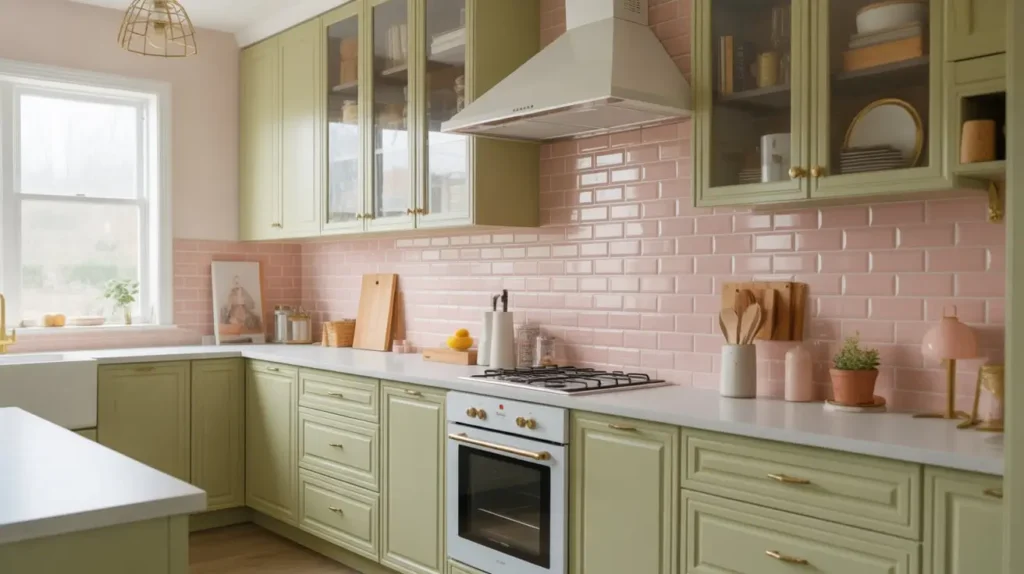
Subway tile is a classic for a reason. It’s clean, it’s timeless, and it’s affordable. But white subway tile? Yawn. We see it everywhere.
Switch it up by using pink subway tile. You can choose a glossy, bright pink for a pop art look, or a handmade, matte pink for a more organic feel. Pair this with sage green cabinets, and you have a kitchen that feels traditional in structure but playful in color.
Tile Layout Matters:
- Herringbone: Laying the pink tiles in a herringbone pattern adds sophistication and movement. It looks more expensive than it is.
- Vertical Stack: Stacking them vertically looks modern and makes the ceiling feel higher.
- Grout: Use white grout to keep it fresh, or a dark grey grout to make the graphic pattern of the pink tiles stand out.
I installed pink subway tiles in a friend’s laundry room once, and every time I see it, I wonder why we don’t use pink tile everywhere. It makes chores feel less like… chores.
14. Luxurious Green Kitchen with Blush Pink Hardware
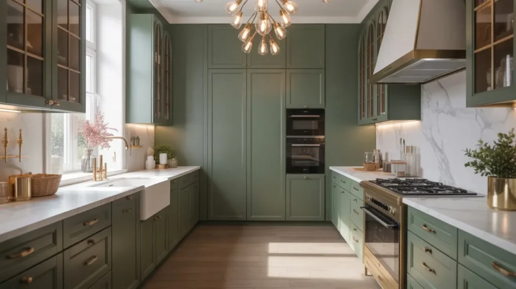
Here is a detail-oriented idea for the minimalist who loves a secret pop of color. You paint the entire kitchen a deep, luxurious green. Cabinets, walls, maybe even the trim. It’s a monochromatic green box.
Then, instead of brass or silver handles, you source blush pink hardware.
Yes, they make this. You can find knobs and pulls made of pink rose quartz, pink leather, or painted ceramic. It’s like putting on a dark green dress and adding pink diamond earrings. It’s a subtle flex.
Why it’s genius:
- Subtlety: It’s not in your face. You notice the green first, then the delightful detail of the pink. It rewards you for paying attention.
- Texture: Rose quartz hardware adds a natural, stone element to painted wood.
- Uniqueness: I guarantee none of your neighbors have pink cabinet handles. It makes your kitchen entirely one-of-a-kind.
This works best with a darker green. If the green is too light, the pink hardware disappears. You want contrast so the handles stand out.
15. Retro Pink and Avocado Green Kitchen
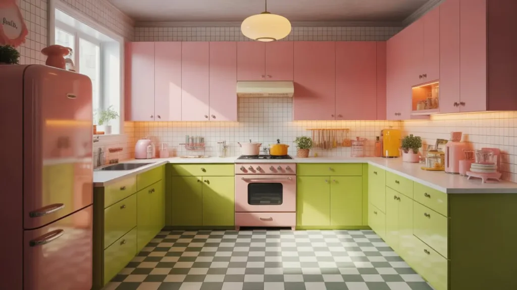
We have to address the elephant in the room: the 1970s. For a long time, “Avocado Green” was a dirty word in interior design. But guess what? It’s back, baby. And it’s cooler than ever.
The key to doing retro pink and avocado green without it looking like a time capsule is to clean up the lines. You want the colors of the 70s, not the clutter or the shag carpet.
Modernizing the Retro:
- The Green: Choose a muted, yellow-based green (avocado), but apply it to sleek, modern cabinetry or a painted island.
- The Pink: Use a vibrant bubblegum or coral pink for the backsplash or appliances.
- Flooring: Terrazzo flooring brings the retro vibe together perfectly. It contains chips of both colors.
- Appliances: Brands like Smeg make fabulous retro-style fridges in these exact colors. A pink fridge against an avocado wall? Iconic.
Opinion Time: This style is strictly for the fun-lovers. If you worry about resale value, skip this. But if you want a kitchen that makes you smile every morning when you pour your coffee, this is it. Life is too short for boring kitchens.
How to Avoid the “Watermelon Effect”
I’ve mentioned the dreaded watermelon comparison a few times. It’s the biggest fear people have with this combo. So, how do you ensure your kitchen looks like a designer masterpiece and not a picnic fruit salad?
1. Watch Your Undertones
This is the boring technical part, but it saves your bacon.
- If your green has yellow undertones (like olive, chartreuse, or moss), pair it with a pink that has warm/orange undertones (like coral, peach, or salmon). The warmth unites them.
- If your green has blue undertones (like teal, emerald, or sage), pair it with a pink that has cool/blue undertones (like magenta, berry, or cool blush).
- Clashing occurs when you mix a warm green with a cool pink. It confuses the eye and feels “off.”
2. Follow the 60-30-10 Rule
You can’t just do 50% pink and 50% green. It feels chaotic.
- 60% Dominant Color: Pick one (usually the green for cabinets or pink for walls) to be the main character.
- 30% Secondary Color: This is your supporting actor.
- 10% Accent: This is usually wood, white, gold, or black to give the eye a place to rest.
3. Use Neutrals as a Buffer
Don’t let the pink and green touch everywhere. Use white countertops, wood floors, or a grey backsplash to create a buffer zone. These neutrals act like a palate cleanser for your eyes.
Lighting: The Make or Break Factor
I cannot stress this enough: Lighting changes color.
I once painted a kitchen sage green that looked gorgeous in the store. Under the client’s warm yellow lightbulbs, it looked like swamp sludge.
- Natural Light: If you have tons of windows, you can get away with darker greens and cooler pinks because the sunlight will warm them up.
- Artificial Light: If your kitchen is dark, stick to lighter shades (blush and mint). Ensure your bulbs are 3000K or 3500K. This is a neutral white light. Anything lower (2700K) is too yellow and turns pink into orange. Anything higher (5000K) is too blue and makes green look clinical and hospital-like.
Final Thoughts: Be Bold
You spend a huge portion of your life in the kitchen. You chop veggies, you help kids with homework, you argue about whose turn it is to do the dishes, and you dance while waiting for the water to boil. Why should that space be boring?
Pink and green is a pairing that represents growth, warmth, and nature. It’s a combination that says you have a personality and you aren’t afraid to show it. It breaks the rules of the “all-white kitchen” era, and frankly, it’s about time.
Whether you go for the subtle elegance of blush and sage or the high-octane drama of emerald and rose marble, the most important thing is that you love it. Who cares what the trends say next year? If you love it, it’s timeless.
So, grab some paint samples. Stick them on the wall. Live with them for a few days. See how they look when you’re making coffee at 6 AM and when you’re pouring wine at 8 PM. And when you finally roll that first coat of green (or pink!) onto your cabinets, take a deep breath. It’s going to look fantastic.
Now, go make your home beautiful. You’ve got this.